Art Blog: New Labels with Cynthia Osaseri
Since its inception, Cantrip Candles has embraced the rustic look. Black text on kraft, on sleek glass and metal. It’s classic, simple, and speaks to its hand-produced nature.
But we’ve grown a lot since 2017.
Now with over 20 scents, an expansion of products, and a growing team, we felt it was time to level up, while still honoring our rustic roots. The purpose of the change was twofold:
- Give a visual reference for the environment and immersion intended with each scent, and-
- Make it easy to distinguish one candle from another, even at a distance (this helps keep us from accidentally mixing up the candles too).
With this in mind, we decided to add detailed art and color to our existing label design, that way we kept our classic look and gave each scent its own unique look.
That’s where Cynthia Osaseri stepped in.
We found Cynthia through the #PortfolioDay tag on Twitter, and her background design work was an instant match for the visuals we were imagining for our labels; strong shapes with fine lines, and meticulous attention to detail. We’re working with limited space, so we knew we had to find someone who could work small without sacrificing detail, while also portraying wide expansive landscapes.
An example of Cynthia’s (@cynicaldrawings) work, shared for Portfolio Day. https://twitter.com/cynicaldrawings/status/1612723900353499137?s=20
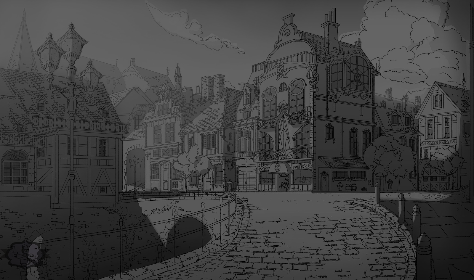
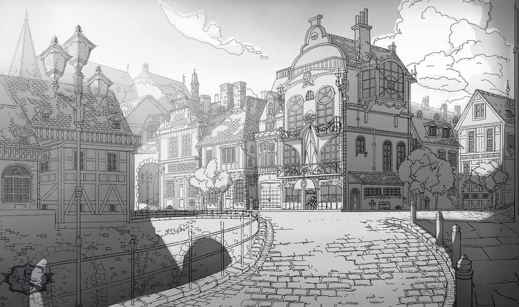
Figwood Orchard was the debut candle for our planned label update, with a Spring 2023 release. Figwood Orchard is a subtle but sweet candle that evokes two of our discontinued scents; Sweet Fig Farmhouse and Le Jardin des Fleurs. We felt a lot of pressure to make sure everything went smoothly, so we put together a sloppy sketch for Cynthia to work from.

The sketch above was the guide provided to Cynthia, while the below shows Cynthia’s final linework.
Getting the finished label art back in return felt celebratory; it was exactly the vibe we were hoping to hit with the new labels. From there, we gave Cynthia descriptions and scent notes along with the occasional visual supplement as reference, but we knew our labels were in good hands.
Color selection was a little trickier to figure out because each label was so unique, and depended greatly on the final linework. In the end, we found that adding color accents to the art in-house worked best. Some labels stuck to a singular color, while others felt like they needed more because the art seemed to demand it, in the best way. Dungeon Depths was one of the labels that was the most difficult to select the colors for, but we are so happy with how it turned out!

Color mockup for Cynthia's Dungeon Depths linework.
All in all, we have a total of 19 labels designed in this way (three of which have yet to be revealed… keep an eye out, they look amazing), and we are so proud of the elevated look of our hand-poured beauties!
Have you gotten to take a closer look at the details in our labels? Do you have any favorites?
Here are ours!

Lines & Color Mockups for Black Hound Tavern, Stonemoss Chapel, Library Scriptorium, and Summerplains, respectively.
Follow Cynthia at @cynicaldrawings on Twitter, or cynical.drawings on Instagram!
Curious what these scents smell like? Shop our expanding collection at cantripcandles.com!